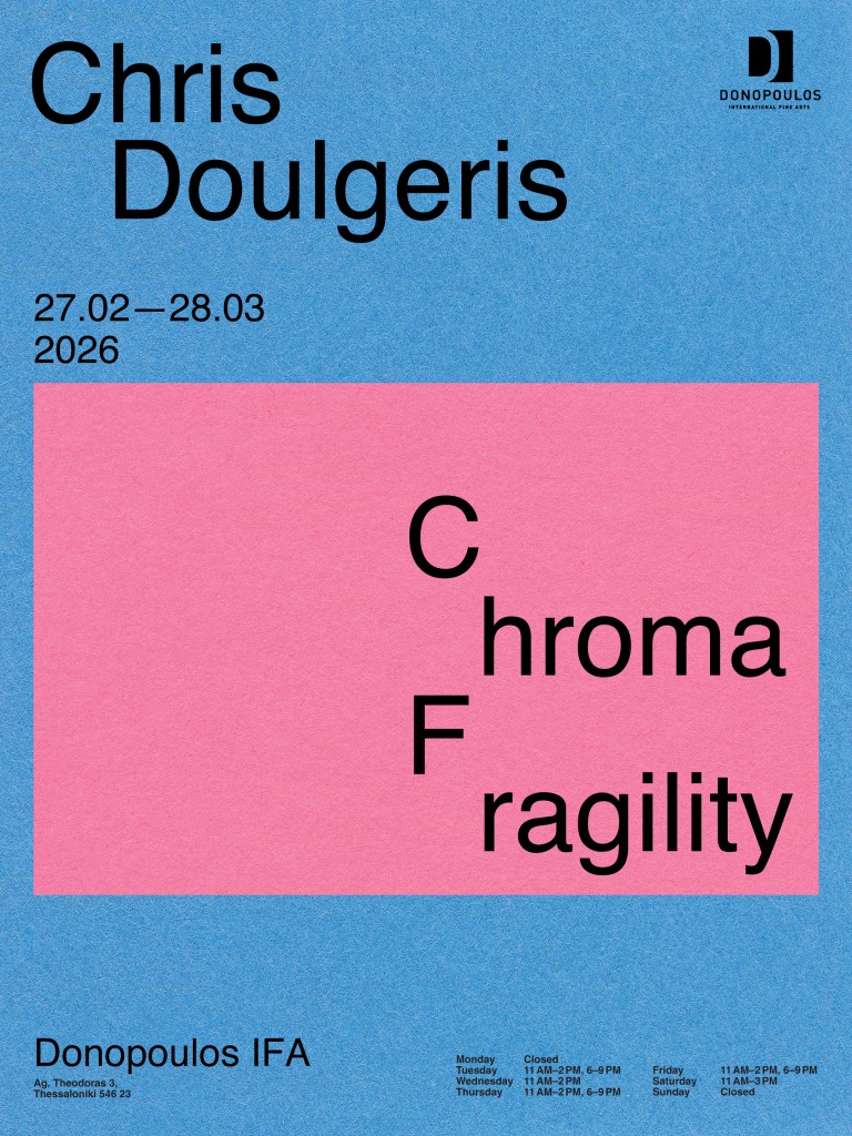
Chris Doulgeris: Chroma Fragility
“It’s not that deep.”—Notes on Colour
The day Chris and I met in his studio last December, I learned that an Amazon worker broke down and died during his shift at a facility in Erfurt. The German newspaper taz reported that the company put up a short obituary in a black frame. Amazon “mourns” this person’s death while simultaneously rejecting responsibility for the immense pressure put on its employees during Black Friday.1
While the word pairing “Black Friday” suggests mourning and grief – without context perhaps even a religious holiday – it’s synonymous with mass consumerism and destructive capitalism. This Black Friday became both a celebration and a warning, an inevitable sacrifice for the cause of capitalism. A black day indeed, for both shopping and workers’ unions.
Colour is no neutral label. It’s a concept continuously (re)defined by people. The associations and symbolism that humans project onto colour through evolutionary instinct, religion, politics, and now, most prominently, advertising and marketing, become means to an end: The circulation of capital.
Every year since 2000, PANTONE publishes its colour of the year along with a whole bunch of fitting merch and suggestions for further consumption. In 2023, it was Viva Magenta – speculations followed that the choice was tied to a pink marketing campaign promoting Greta Gerwig’s new Barbie (2023) movie. 2025 was the year of Mocha Mousse, a colour that users on social media quickly rejected as a pretentious reiteration of “Sad Beige” and “Millennial Grey.” PANTONE’s colour of the year for 2026 was peak rage bait: Cloud Dancer, a simple shade of white. Drawing a connection to a political climate that increasingly favours and justifies white supremacy, social media users coined the term #pantonedeaf. Monopol author Leonie Wessel pointed out that the colour choice might be a sign of collective capitulation to the global far-right wing vibe shift – or the call for one.2
Colour is not a fact, but an agreement. It’s not existing matter, but an optical phenomenon produced and processed by the brain. There is nothing inherently orange about the colour we label “orange.” With language being the only common denominator, colour becomes a field of negotiation with the inevitable risk of misunderstanding. There is no way to be sure that two people perceive the same colour on the level of optics, language or culture. What is blue to one person is teal to another. People resist the subjectivity of colour by all available means. Analog tools like Shirley Cards, Grey Cards, and ColorChecker Passports attempt to define common ground. In the digital realm, hex codes assign rational digits to fluid optical phenomena. But not even a screen can guarantee an objective and truthful representation of colour, because the screen remains the mediator. And each screen is different.
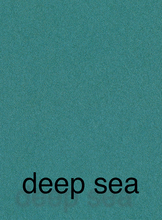
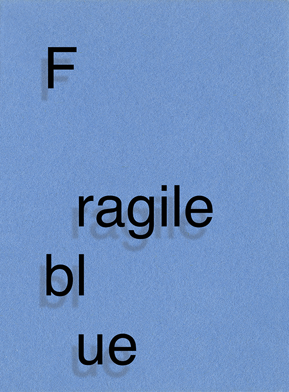
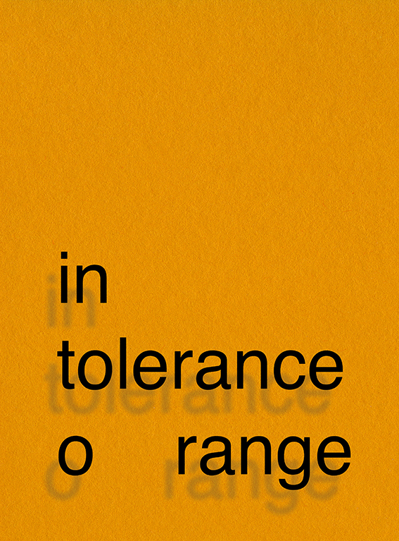
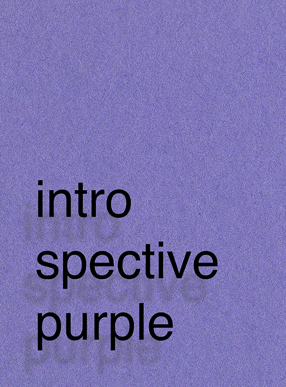
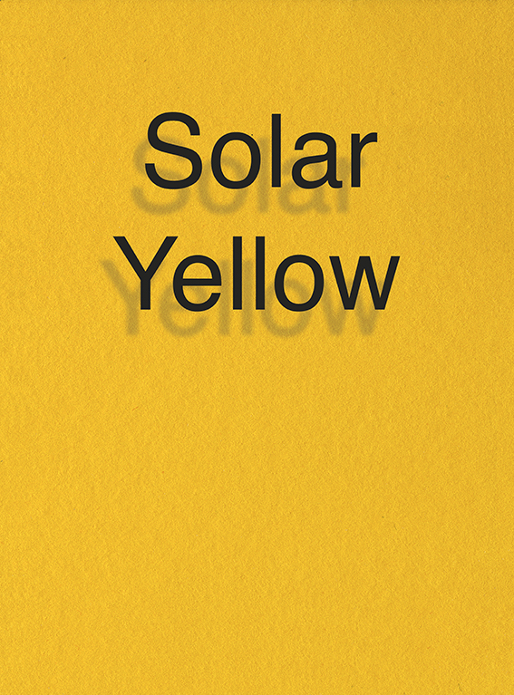
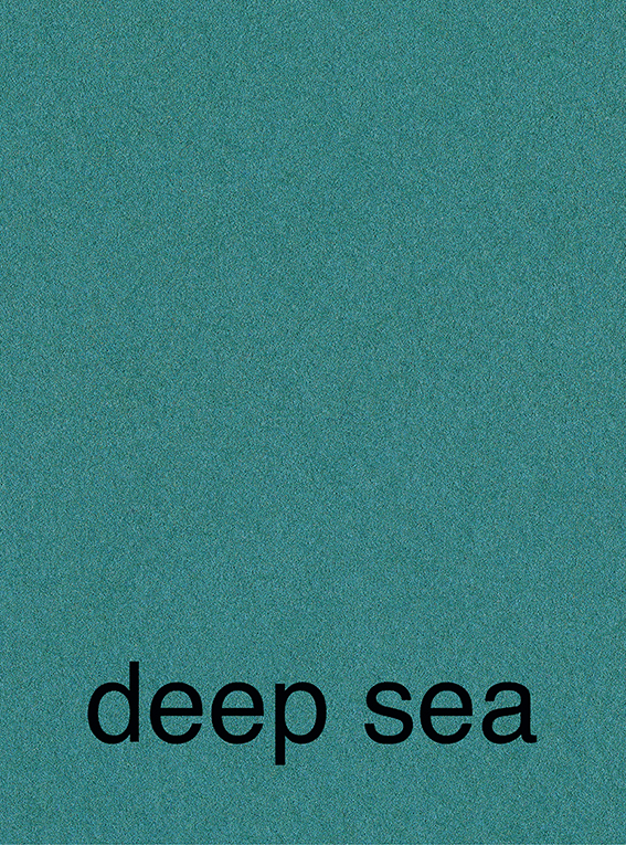
In his new body of work, Chris re- and deconstructs the multiple meanings of colour. His starting point is colour samples used in commercial photography. Each sample comes with a number and unique name that targets emotions, meant to trigger a buying decision. Chris scans those samples and reprints them on a larger scale. He appropriates the existing material of commodification to distort it. If commercially defined colours are appropriated from “existing” colours, Chris appropriates that commercial appropriation for his artistic investigation, aligning himself with the tradition of 1980s Appropriation artists and the Pictures Generation.
In that process, he transfers the samples’ paper texture as well. In the analogue realm, colour is not an even surface. True evenness is only possible in the flatness of the digital. Each surface blemish, each undulation and unevenness, makes space for shade and light, leading to colour variations from millimetre to millimetre. Which exact point within this colour field is the most accurate representation of the chosen colour? Is it the average of all those fluttering points?
Glass separates the viewers from the colour on paper. The glass mediates perception of the work, just as language mediates perception of colour. While glass suggests transparency, it also conceals the technical mechanisms that shape each person’s understanding of colour.
Chris gives those existing colour samples new names, which he writes onto the glass. The name becomes part of the lens through which one perceives colour. Instead of uniformly confining those names to the lower right corner in a discrete font, Chris enlarges them, highlighting their role in the perception and interpretation of colour.
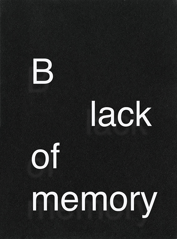
Chris subverts the language of commodification through confrontation. While a lipstick shade might be called Fairytale Ending, or a wall paint colour French Linen, to boost marketability, Chris adds meaning that confronts and conflicts with the chosen colour. Names are deconstructed into separate letters, breaking paragraphs and reading directions. BLACK OF MEMORY (2025) plays with commemoration and forgetting. Just as black frames are used for pictures of the deceased. A “blackout” erases memory. The difference is just a line break. The deconstruction of words borrows from Concrete Poetry, which pulls words apart from their obvious or agreed meanings to reveal subconscious connotations. Addressing the subconscious is liberating reflection in art and enslaving reaction under oppressive economic and political systems.
Becoming conscious of those mechanisms requires critical vigilance, if only it wasn’t so horribly inconvenient. It’s always easier to brush it off and say, “It’s not that deep.”
Jennifer Braun
The Gen Z Art Critic
1 Anne Fromm: “Der tote Mitarbeiter,” taz, December 4, 2025, https://taz.de/Tragoedie-bei-Amazon-in-Erfurt/!6135223/
2 Leonie Wessel: “Pantone-Trendfarbe 2026: Der Ton der Kapitulation,” Monopol, 09.12.2025, https://www.monopol-magazin.de/pantone-trend-farbe-2026-cloud-dancer